+1-800-298-3165
What makes a good mobile landing page?
3 design tips to ace your mobile site’s performance

It’s no secret that many of us now turn to our mobile devices to go online more than ever before. It’s been six years since Google said that it handles more mobile searches than desktop and much has already been shared about the switch to a mobile first index. That’s all old news. What’s new is that we aren’t just using our smart phones to browse on the daily commute or kill time. We’re increasingly using them to buy products and services.
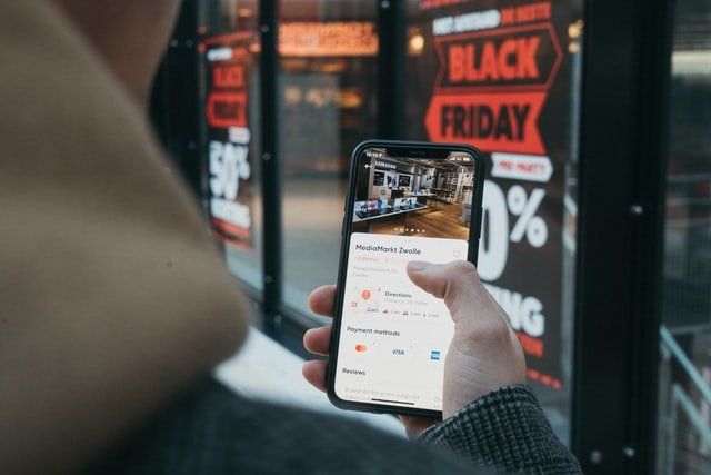
According to Adobe data , shopping on mobile devices grew 25% on Black Friday 2020 alone. Having a well designed landing page for mobile users is key to tapping in to this consumer confidence in m-commerce and willingness to purchase from their tablet or smartphone.
1. Keep your design free of clutter
Mobile devices have smaller screens which means that designs must be keep clean and clutter free. Too many elements make it difficult to locate key information when screen real estate is limited and can create confused consumers who aren’t sure where to go or what to do in order to complete their goal.
Minimal designs work best, with easy to navigate elements and clear, concise information that can be easily visually processed and scrolled through when using a small screen.
2. Be clever with your use of colour
Because smartphone screens are smaller, you need to work harder to help the visitor. One easy way to do this is to have your call to action in a contrasting colour to the rest of the text on the page. This makes it easy to see, even when scrolling on a phone, so it’s clear what the visitor needs to do next.
3. Place buttons strategically through the page
It’s less convenient to scroll up and down when you’re on a mobile device than on a desktop with a mouse. The most effective landing pages therefore remove the need to scroll all the way down to the bottom of the page, or all of the way back up again to complete an action by placing buttons strategically throughout the page. This might mean that you have two, three or even four buy now buttons for example at the top, middle and bottom of your page, spaced throughout so the visitor can easily click to go through to checkout.


